

I've always loved to create nice solutions with only CSS for everyday problems.
One of them is to create a Custom Checkbox without any third-party js libraries.
The HTML
First, we should create an HTML snippet for our component.
<div class="wrapper">
  <input type="checkbox" id="custom-checkbox">
  <label for="custom-checkbox" id="custom-checkbox-label"></label>
</div>
We will need the .wrapper because that will help with our position properties for the checkbox.
The CSS
We will use css vars for our demo, just to keep the CSS simple.
:root{
  --inactive-bg-color: #202136;
  --active-bg-color: #FFFFFF;
  --white-color: #FFFFFF;
  --border-color: #FFFFFF;
  --orange-color: #FE5E00;
  --red-color: #F64562;
  --gradient:  linear-gradient(125deg, rgba(254,94,0,1) 0%, rgba(246,69,98,1) 100%);
  --checkbox-width: 150px;
  --checkbox-height: 60px;
  --dot-y-pos: calc(calc(var(--checkbox-height) - calc(var(--checkbox-height) - 10px)) / 2);
  --dot-x-start-pos: calc(calc(var(--checkbox-height) - calc(var(--checkbox-height) - 10px)) / 2);
  --dot-x-end-pos: calc(var(--checkbox-width) - calc(var(--checkbox-height) - 5px));
  --animation-speed: .25s;
}
Then we will add some properties to our .wrapper div.
.wrapper{
  width: var(--checkbox-width);
  height:var(--checkbox-height);
  position: relative;
}
We need to hide the real checkbox
#custom-checkbox{
  visibility: hidden;
}
Now for the interesting parts! We will style our label which will serve as our checkbox UI.
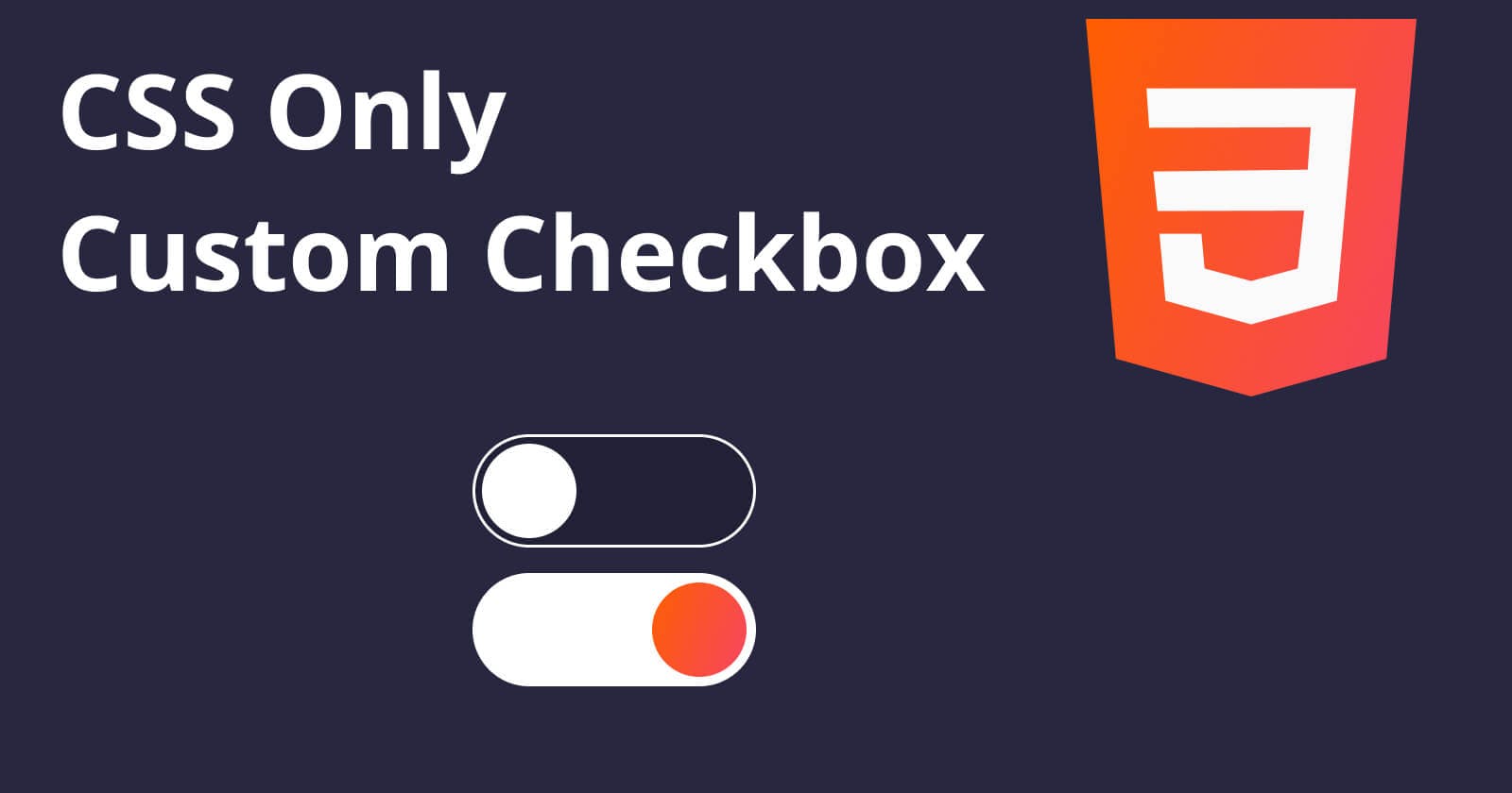
#custom-checkbox-label{
  position: absolute;
  top:0;
  left: 0;
  width: 100%;
  height: 100%;
  display: block;
  background-color: var(--inactive-bg-color);
  border: 2px solid var(--white-color);
  border-radius: calc(calc(var(--checkbox-height) / 2) + 2px);
  transition: background-color var(--animation-speed) linear;
  cursor: pointer;
}

#custom-checkbox-label:after{
  content: '';
  position: absolute;
  z-index: 2;
  width: calc(var(--checkbox-height) - 10px);
  height: calc(var(--checkbox-height) - 10px);
  border-radius: calc(calc(var(--checkbox-height) - 10px) / 2);
  background-color: var(--white-color);
  top: var(--dot-y-pos);
  left: var(--dot-x-start-pos);
  transition: all var(--animation-speed) linear;
}
As you can see, we use the :after pseudo-element which will draw the dot in our checkbox UI.
We have our Custom Checkbox, but we should be able to animate it on the browser click event as any other normal checkbox. That's why we have to add an ID to the checkbox which will be referenced in our <label> with the for="" attribute.
<input type="checkbox" id="custom-checkbox">
<label for="custom-checkbox" id="custom-checkbox-label"></label>
In CSS, checkbox-typed inputs have the :checked pseudo-class which will come in handy for us, for styling and animating our Custom Checkbox if the user changes the checked state.
Also, we will use the + sign which is called adjacent sibling combinator*.* That selector will help us to change our styles in our label if the checkbox is checked.
#custom-checkbox:checked + #custom-checkbox-label{
  background-color: var(--active-bg-color);
}
#custom-checkbox:checked + #custom-checkbox-label:after{
  left: var(--dot-x-end-pos);
  background-color: var(--orange-color);
}
You can read more about the adjacent sibling combinator in the MDN documentation.
And that's it! We just created our Custom Checkbox without any usage of Javascript.
You can play with it and try it out in this Pen.